2 or 3
Things
About
2 or 3
Things
About
2 or 3 Things About
EXPERIMENTAL JETSET
EXPERIMENTAL JETSET
EXPERIMENTAL JETSET
ARTIFACTS : Print, Editorial, Motion, Mobile
TOOLS USED : Adobe CC (Indesign / AfterEffects / Photoshop / Illustrator), Figma
ROLE: Sole designer | TIMESPAN: 14 weeks
ARTIFACTS: Print, Editorial, Motion, Mobile
TOOLS USED: Adobe CC (Indesign / AfterEffects / Photoshop / Illustrator), Figma
ROLE: Sole designer
TIMESPAN: 14 weeks
ARTIFACTS : Print, Editorial, Motion, Mobile
TOOLS USED : Adobe CC (Indesign / AfterEffects / Photoshop / Illustrator), Figma
ROLE: Sole designer
TIMESPAN: 14 weeks
THE VIDEO
A TENOUS RELATIONSHIP WITH HELVETICA
THE VIDEO
A TENOUS RELATIONSHIP WITH HELVETICA
THE VIDEO
A TENOUS RELATIONSHIP WITH HELVETICA
My goals with the video were to give some insight as to why the name Experimental Jetset is nearly synonymous with Helvetica. The studio found early on that using a single typeface family offered clarity in a time where the Internet spoiled graphic designers with a novel abundance, in typeface access, among other tools. The studio grapples with Helvetica becoming fused with their percieved identity, when at the core, Jetset simply sees Helvetica as a blank canvas used to convey their thinking.
My goals with the video were to give some insight as to why the name Experimental Jetset is nearly synonymous with Helvetica. The studio found early on that using a single typeface family offered clarity in a time where the Internet spoiled graphic designers with a novel abundance, in typeface access, among other tools. The studio grapples with Helvetica becoming fused with their percieved identity, when at the core, Jetset simply sees Helvetica as a blank canvas used to convey their thinking.
My goals with the video were to give some insight as to why the name Experimental Jetset is nearly synonymous with Helvetica. The studio found early on that using a single typeface family offered clarity in a time where the Internet spoiled graphic designers with a novel abundance, in typeface access, among other tools. The studio grapples with Helvetica becoming fused with their perceived identity, when at the core, Jetset simply sees Helvetica as a blank canvas used to convey their thinking.
OVERVIEW
DELVING INTO JETSET'S WORK AND THINKING
OVERVIEW
DELVING INTO JETSET'S WORK AND THINKING
OVERVIEW
DELVING INTO JETSET'S WORK AND THINKING
I spent my Sophomore Spring semester creating a video, booklet, poster, and mobile prototype to honor my "design hero", the Amsterdam-based studio Experimental Jetset. The challenge of this project was firstly in maintaining visual cohesion across different mediums. Secondly, with communicating both the sheer amount of work the studio has done and drawing viewers in to explore that work in depth.
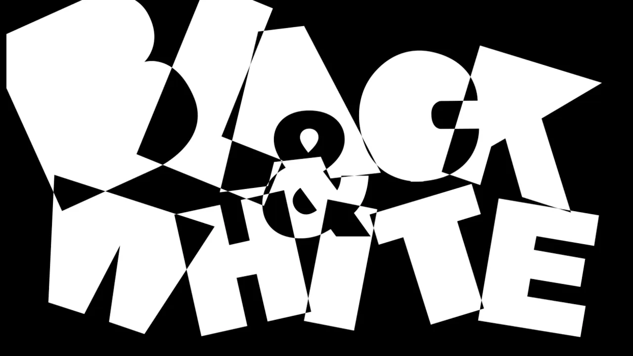
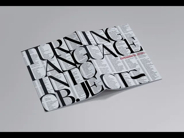
Experimental Jetset is more accurately described as typographers than strictly designers. Their work is never commercial, partnering with museums and creative organizations to produce printed matter, installations, and graphic identity. To pull a direct quote from their site, they see their work as "turning language into objects"; that the language and designs we use hold material weight and meaning. This punk attitude towards a field like graphic design is a result of the culture the members of Experimental Jetset grew and developed in. My booklet was type-focused, as doing otherwise felt sacreligious to Jetset's signature style.
I spent my Sophomore Spring semester creating a video, booklet, poster, and mobile prototype to honor my "design hero", the Amsterdam-based studio Experimental Jetset. The challenge of this project was firstly in maintaining visual cohesion across different mediums. Secondly, with communicating both the sheer amount of work the studio has done and drawing viewers in to explore that work in depth.
Experimental Jetset is more accurately described as typographers than strictly designers. Their work is never commercial, partnering with museums and creative organizations to produce printed matter, installations, and graphic identity. To pull a direct quote from their site, they see their work as "turning language into objects"; that the language and designs we use hold material weight and meaning. This punk attitude towards a field like graphic design is a result of the culture the members of Experimental Jetset grew and developed in. My booklet was type-focused, as doing otherwise felt sacreligious to Jetset's signature style.
THE BOOKLET
IDEOLOGICALLY PUNK FROM START TO FINISH
THE BOOKLET
IDEOLOGICALLY PUNK FROM START TO FINISH
THE BOOKLET
IDEOLOGICALLY PUNK FROM START TO FINISH
This 16-page booklet is a deeper dive into Experimental Jetset's influences, design philosophy, studio dynamic, and more. This also includes their signature typeface Helvetica, which serves as an apt poster-child of the studio's stylistic straightforward typography.
I used Helvetica Neue, shifting to Helvetica Neue Condensed in red as a visual motif. I chose to experiment with Baskerville Display for the booklet cover in order to contrast a studio exclusively using sans serifs. The cover also carries the text catalogue of Jetset's entire body of work, carried over from the poster. This is to place emphasis on the span of their body of work.

THE POSTER
A VERITABLE FLOOD OF MATERIAL
THE POSTER
A VERITABLE FLOOD OF MATERIAL
THE POSTER
A VERITABLE FLOOD OF MATERIAL


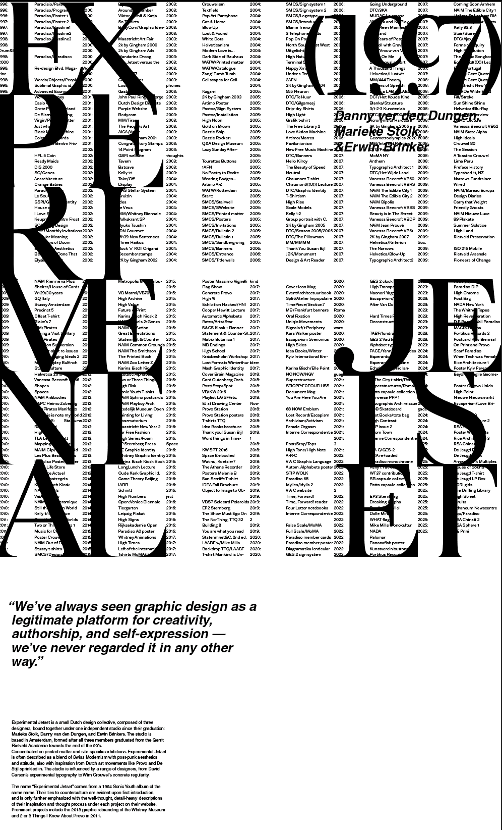
I made the largest number of conceptual explorations for the poster. (a few lo-fi drafts are pictured below). As the first section of the project, the poster served as the introduction to everything else that follows. I was faced with communicating both the quantity and the appeal of Experimental Jetset's work in order to draw people into the rest of the project, but also grappled with being overwhelmed by the amount of information myself.
I chose to combine a complete textual list of their work with an overlay of selected visual samples of what I felt were their most exemplementary artifacts, mixed with my personal favorites. I stuck with no colors aside from these images to contrast the sheer amount of cognitive overload being presented. The poster is the beginnings of my type-based visual identity for this project, as a call to Jetset's own focus on typography.
MOBILE PROTOTYPE
TRANSLATING A NON-DIGITAL STUDIO TO THE DIGITAL
MOBILE PROTOTYPE
TRANSLATING A NON-DIGITAL STUDIO TO THE DIGITAL
MOBILE PROTOTYPE
TRANSLATING A NON-DIGITAL STUDIO TO THE DIGITAL
The full prototype walkthrough can be found linked here:
The full prototype walkthrough can be found linked here:
The full prototype walkthrough can be found linked here:
The mobile prototype continues the use of red Helvetica Neue Condensed as a visual motif. As Experimental has virtually no presence in the sphere of UI/UX or web design, I was handed essentially a sandbox to play in.
The mobile prototype continues the use of red Helvetica Neue Condensed as a visual motif. As Experimental has virtually no presence in the sphere of UI/UX or web design, I was handed essentially a sandbox to play in.
The mobile prototype continues the use of red Helvetica Neue Condensed as a visual motif. As Experimental has virtually no presence in the sphere of UI/UX or web design, I was handed essentially a sandbox to play in.

© AUDREY ZHAO / 2026
CONTACT:
© AUDREY ZHAO / 2026
CONTACT:
© AUDREY ZHAO / 2026
CONTACT: