App Objectives:
Show NewsSerif in use within a mobile interface as both body and header
Highlights special features of its typographical anatomy
Show the character set of NewsSerif, as well as its standout glyphs
Display samples of potential type pairings
Some amount of historical background and examples of the typeface in real-world applications.
EDITORIAL SPREAD

PROJECT BRIEF
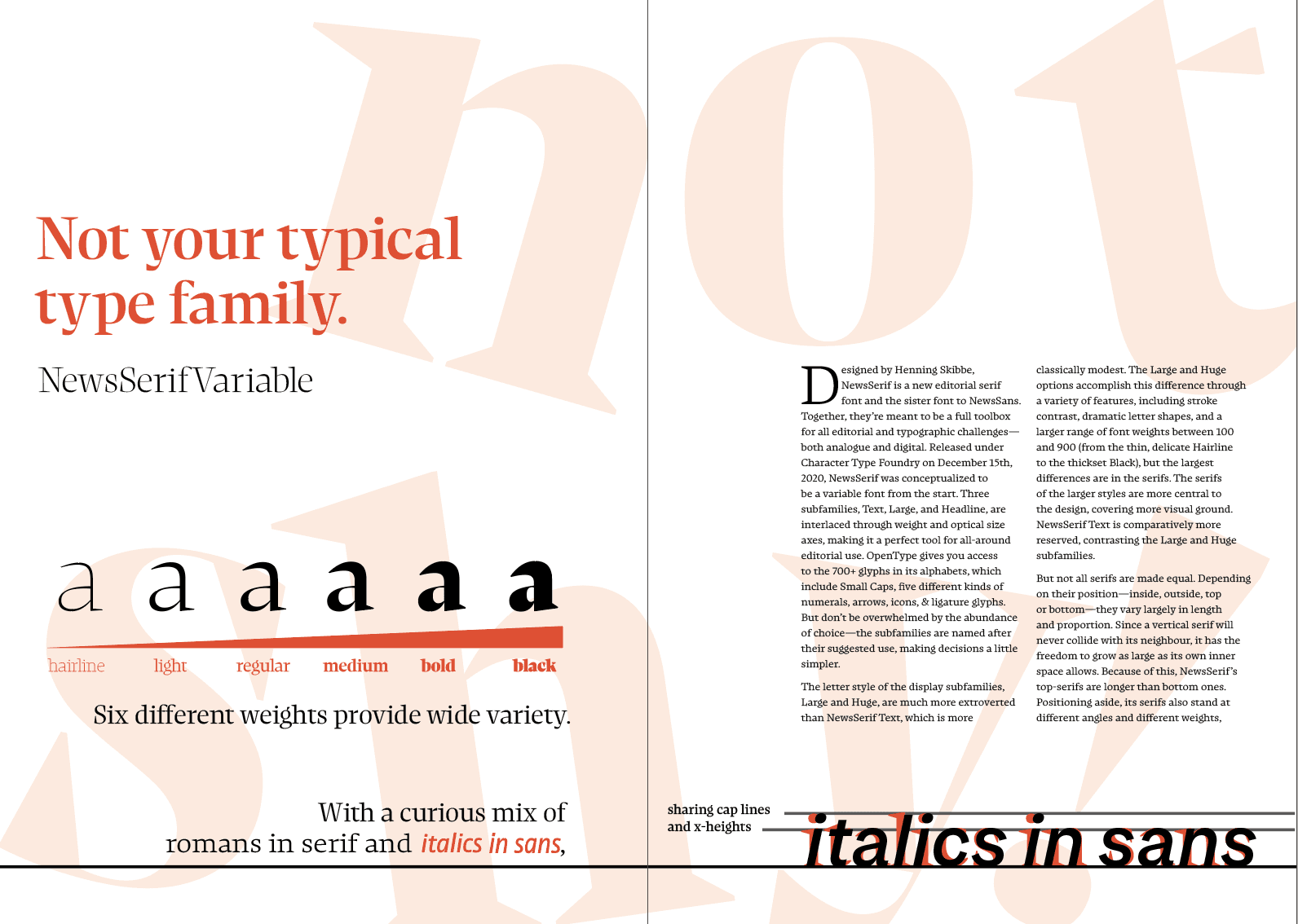
For the spread, I chose a color palette of black-and-white with red as an accent color. I composed an essay about NewsSerif Variable's history and key qualities to use as the body copy of a four-page spread (one title page, a spread regarding the typeface in general, and its relevance to a certain assigned typographic term).
Next, I used Figma to create a mobile app prototype — a typebook experience — showing how a user might use it to compare font pairings and explore different sizes and weights of a font coupled with the accessibility of a smartphone. Demo clips of the app mock-up are shown above under the Mobile Interface Prototype section.
ITERATIONS


